Lumina Design
Lumina Design is a design system for dark user interfaces. It utilizes light to guide the user’s attention and to achieve elevation. Lumina Design is meant for interfaces that will be used in poor lighting conditions or for battery conservation.
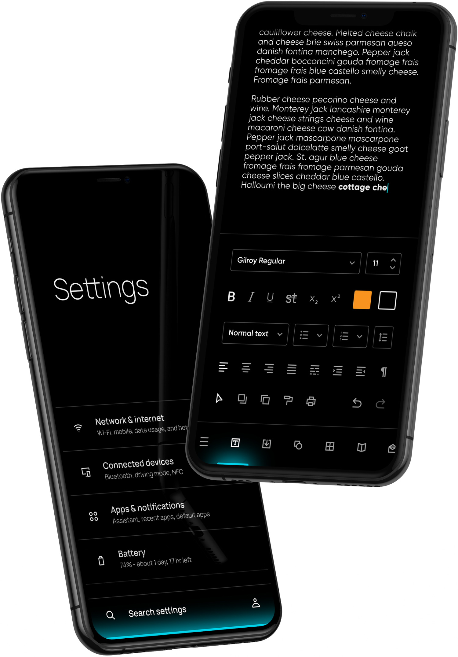
The light bar is the most essential design element of Lumina Design. It follows the edge of the screen and highlights the most important component. It can be used to indicate tab selection, progress, or even Boolean inputs.

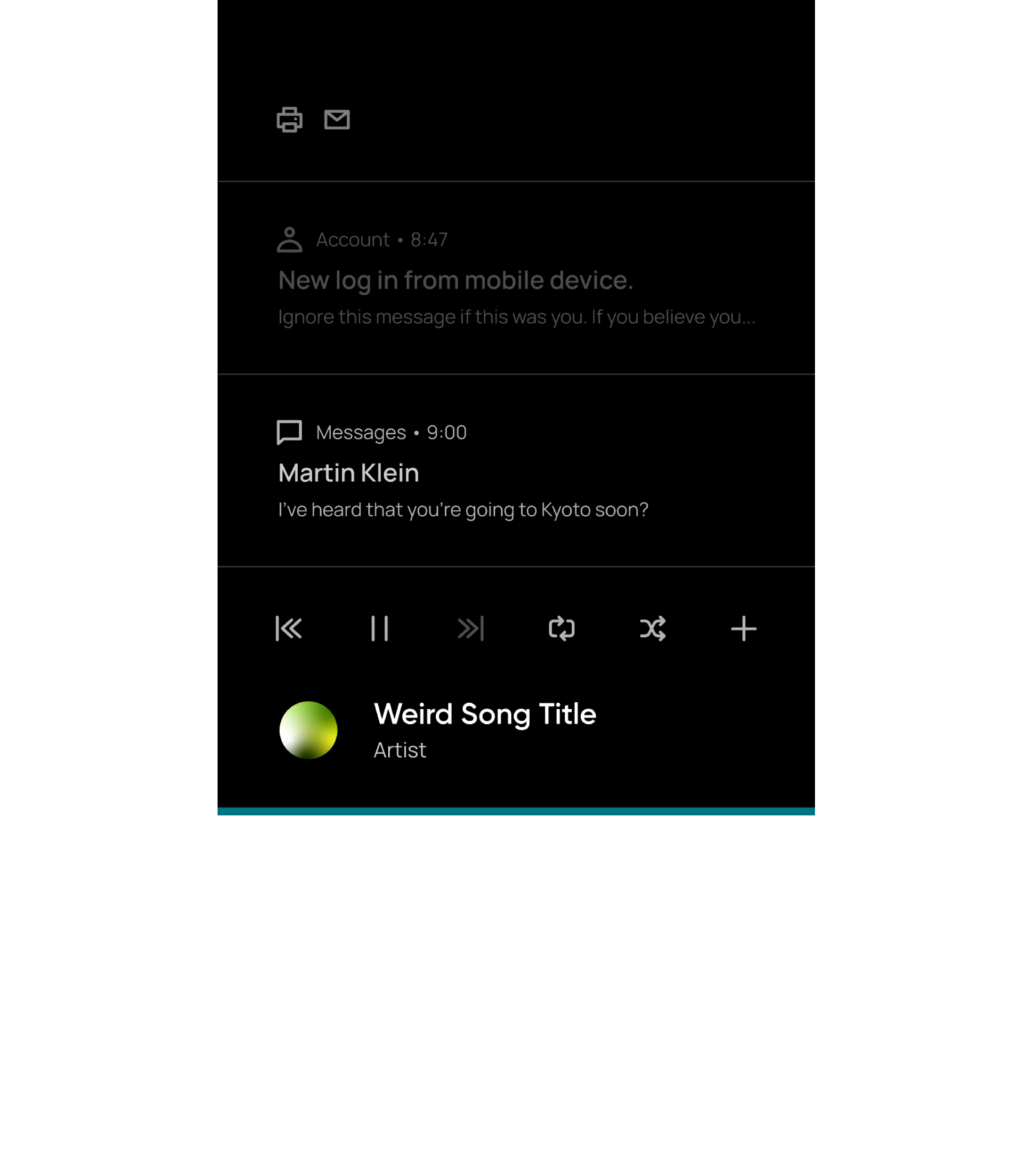

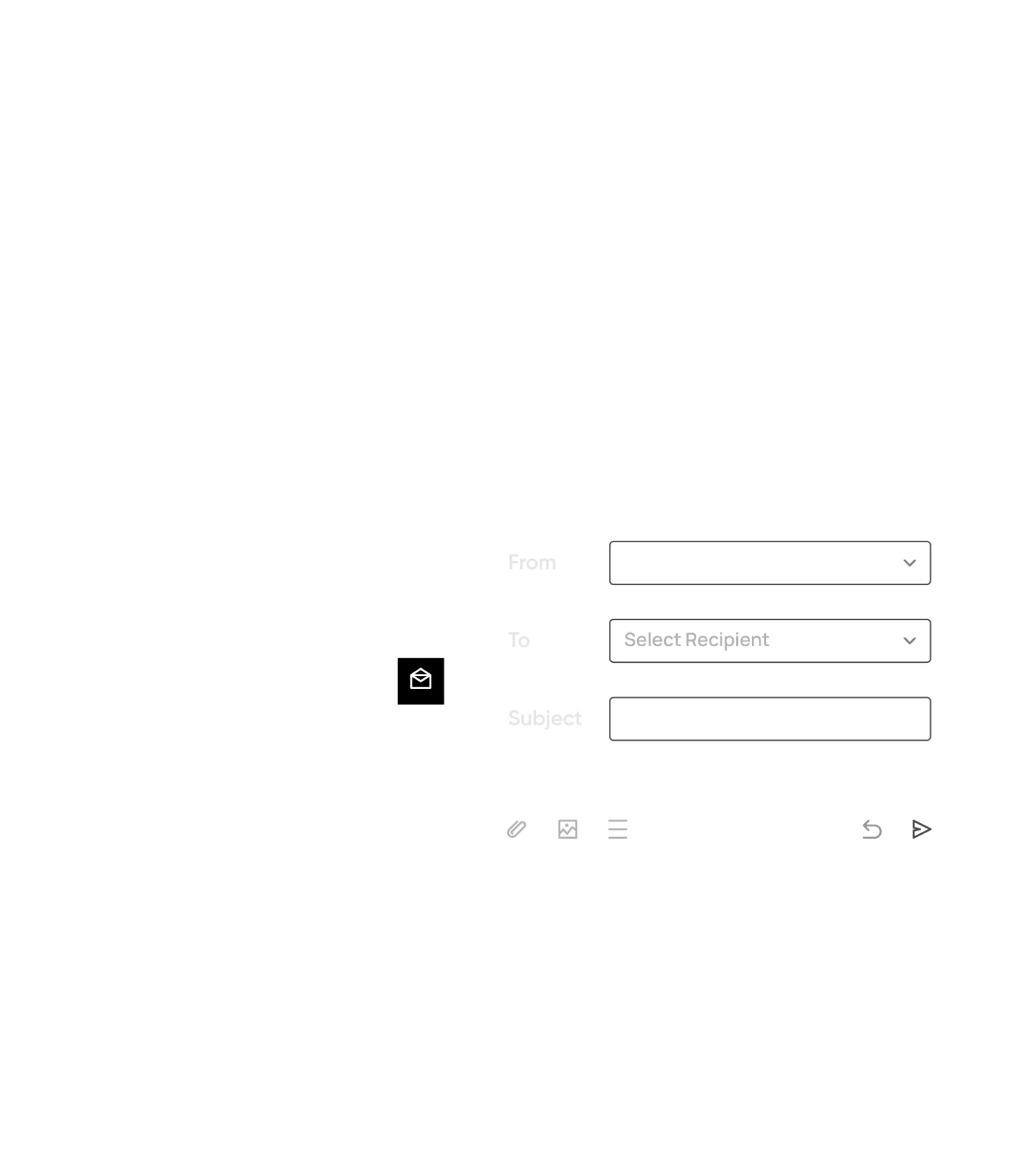
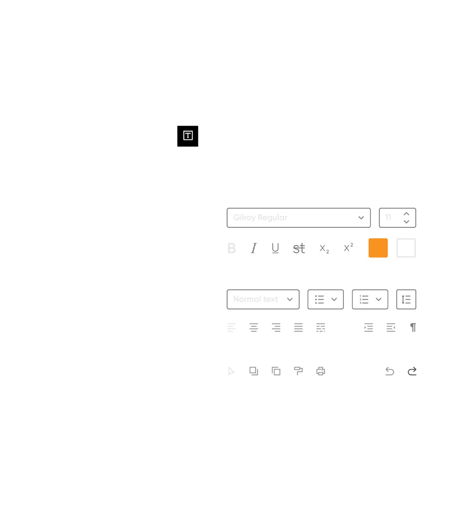

Lumina Design interfaces are responsive. Not only can each interface adapt to different screen sizes and aspect ratios, but their layout also changes to improve usability. On mobile devices, all interactive elements are kept at the bottom half of the screen.
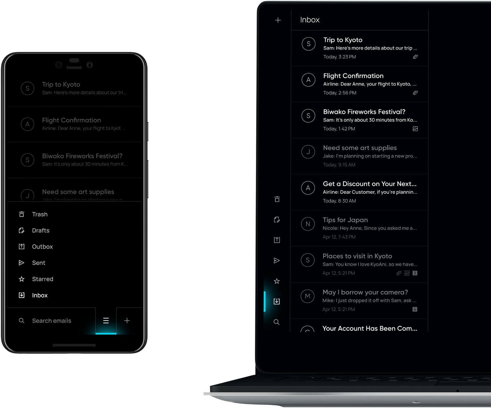
Components can also change according to the input method. When a device is accepting touch input, components will increase their activation area and resize elements to make them more touch-friendly.
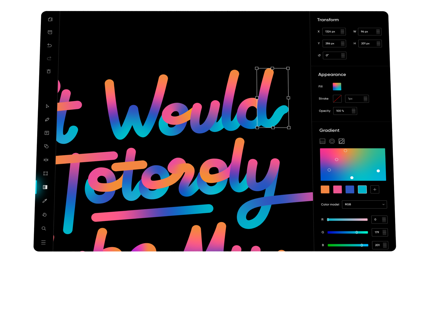
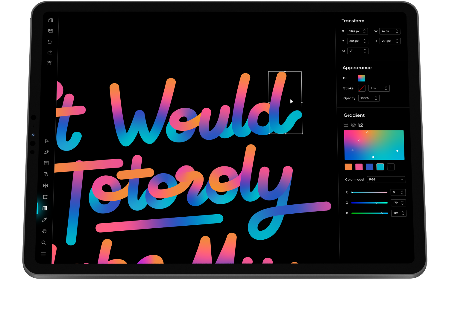
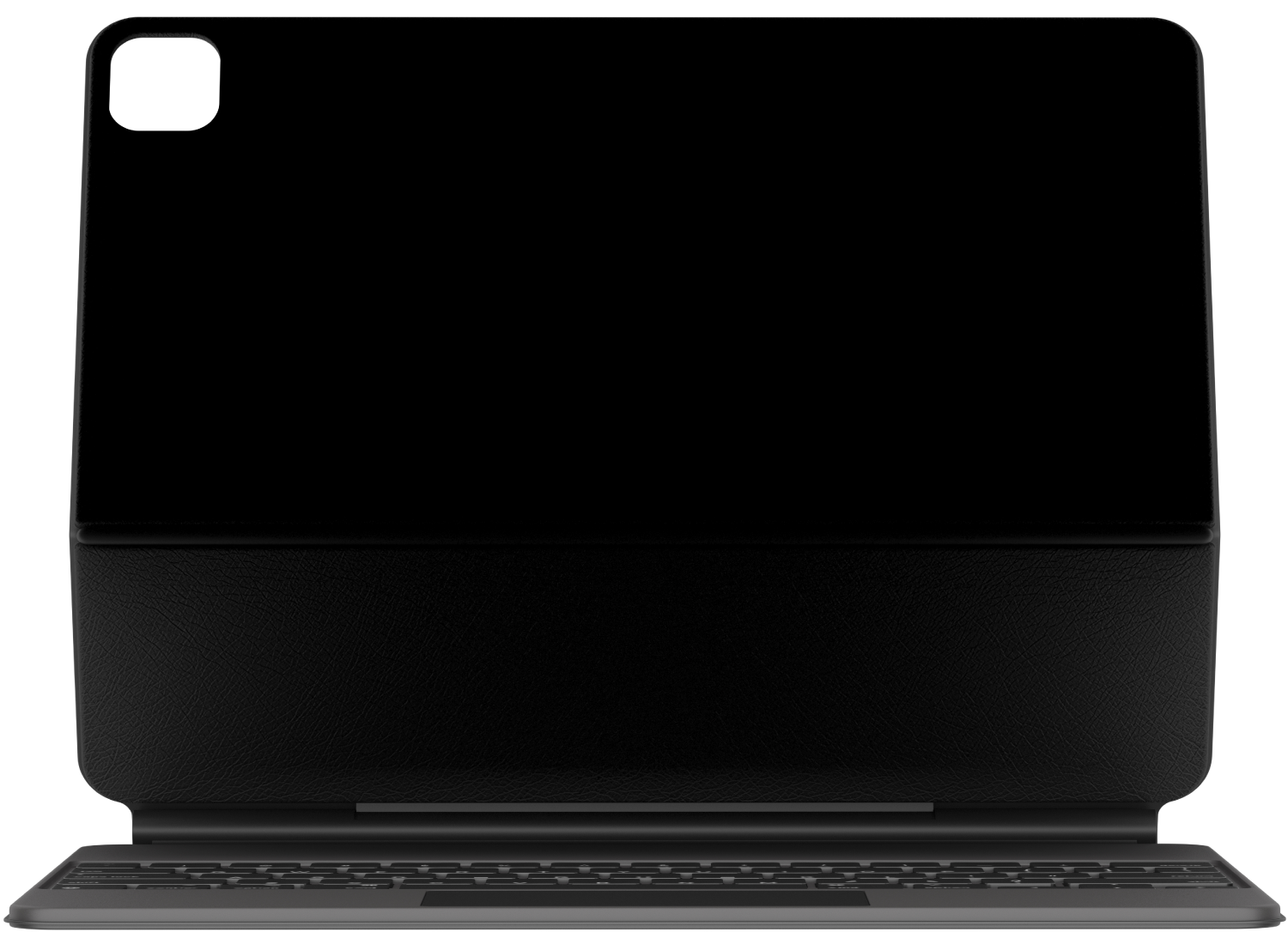
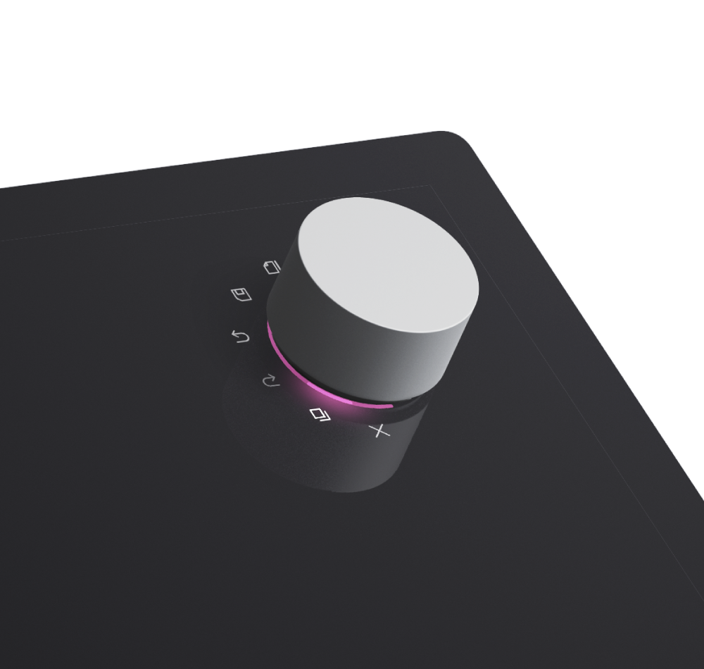
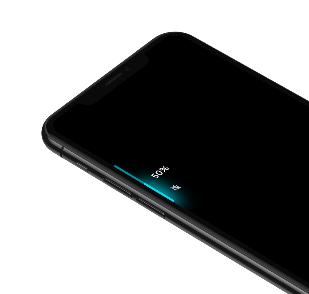
Hardware-triggered UI elements are displayed as close to their trigger as possible. This reduces any additional confusion that may come with using devices in low light conditions.
To keep layouts consistent across different languages, icons are used whenever possible. The Lumina Design Icon Set is a growing library of variable icons that will be available soon.
Site info →
Copyright 2020 Xiangrui Fu. All rights reserved.